Layout Content for Optimal User Experience: Insights by a Web Design Company for Travel Agents
Your potential clients are browsing online to find their next dream holiday, and in this digital age, your travel agency’s website is your showroom. You want them to not only find what they’re looking for but also to enjoy the journey while they’re at it. Convenient navigation and clear, appealing content are more important than ever. Whether it’s the homepage or a detailed itinerary page, efficient Web Design Agency planning can make all the difference. But how do you layout your site so users don’t just visit, but remember you and come back?
Here’s where you start: think like your users. Understand what they want when they land on your site and make their path as smooth as possible. This blog will guide you on how to organise your content effectively to boost user engagement. Dive into practical tips to make your travel agency’s site navigate like a dream. Think of this as your guidebook to creating a site layout that not only showcases your offers but does so with flair and efficiency.
Understand Your Visitor’s Journey
To start, put yourself in your customer’s shoes. When they land on your site, what are they looking for? Is it a quick weekend getaway? Or are they searching for an adventure trip? Make sure your homepage answers these questions immediately. Offer clear paths to major sections right from the top of the page. Keep navigation simple and intuitive – the less your visitors have to think about where to go next, the better.
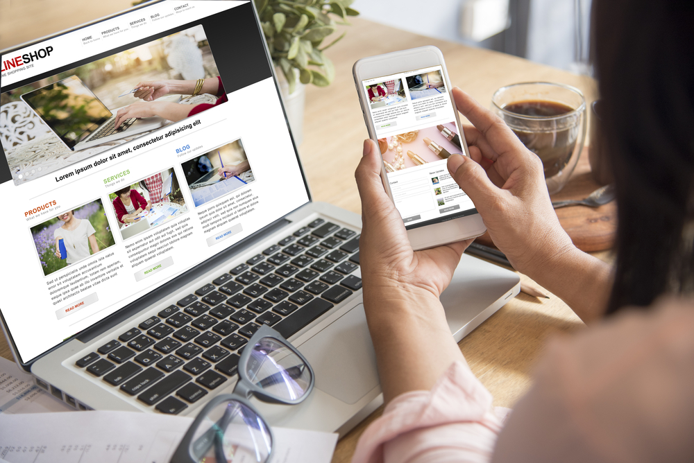
Prioritise Mobile Experience
Your customers will likely browse your site using their phones. Ensure your site is mobile-friendly. Responsive design isn’t optional anymore – it’s a must. Test the layout on various screen sizes. Ensure that images load quickly and text is readable without zooming in. A mobile-optimised site helps keep users engaged and reduces bounce rate.
Use Engaging Visuals Wisely
The travel industry thrives on visuals. High-quality images and videos can transport your visitors to a destination in seconds. But, don’t go overboard. A cluttered page with too many graphics can slow down load times and frustrate users. Incorporate images strategically. Use visuals to highlight your key selling points and guide the user’s eye toward essential information or calls to action.
Craft Concise, Actionable Copy
Your visitors don’t have time to wade through paragraphs of text. Be brief but informative. Clearly explain what you offer and what users need to do next. Actionable language like “Book now” or “Learn more” can guide users to your desired outcome. Ensure that each section of your page has a purpose and helps move the visitor down the conversion funnel.
Easy-to-Find Contact Information
Make sure your contact information is easily accessible. Whether it’s a phone number, email, or contact form, users should know where to reach you without searching hard. Consider having a dedicated contact page, and link to it from the footer of every page. Some people prefer chatting online, so integrating a live chat feature could also enhance user experience.
Incorporate User Reviews and Testimonials
Travel deals often thrive on word-of-mouth, and online reviews are the new personal recommendations. Don’t bury your reviews deep within your site. Bring them up front. Showcase them prominently, maybe even near the top of your homepage or alongside service details. Genuine testimonials add credibility and can significantly influence a visitor’s decision to book with you.
Optimise Page Load Speed
In our fast-paced world, seconds count. Aim for quick page loading times to keep visitors engaged. Compress images, minimise HTTP requests, and use caching where possible. Slow load times can lead to high bounce rates and frustrated users who might not return. Investing time in technical fine-tuning here can pay off in visitor retention.
Create an FAQ Section
Having an FAQ section can clear up common queries and reduce pressure on customer service. It’s a helpful way to give immediate answers to frequently asked questions. If users have to search to find answers to basic questions, they might choose to leave instead. Keep the FAQs straightforward, covering important areas like booking changes, cancellation policies, or payment methods.
Use Structured Lists for Clarity
When presenting options or instructions, consider formatting them into lists. It breaks up text and makes information easier to digest. Use lists sparingly but effectively to draw attention to key features or steps. A list of your top destinations or a step-by-step process to book a trip can clarify details quickly.
- Highlight top travel destinations
- Outline step-by-step booking process
End On a Strong Call to Action
End your pages with a strong call to action. Encourage your visitors to reach out, book a service, or share your content. A well-designed call to action can sway users into taking the next step. Test different placements and wording to find what works best for your audience.
Getting your content layout right is crucial. For more on how to enhance your travel site, visit our Web Design for Travel Agents page. Make your users’ journey on your site as enjoyable as the trips you offer, and you’ll stand out in a crowded market.
